Decal for customers

Welcome to the ZXRworld forum.

Moderator: Moderators

Post Reply

Which Logo

1)
0
No votes
2)
11
100%
3)
0
No votes
 
Total votes: 11

User avatar
Mori Man
Blingmeister
Blingmeister
Posts: 1976
Joined: Thu May 10, 2007 3:30 pm
My Bike: ZXR400J2
Location: JAPAN

Decal for customers

Post by Mori Man »

Have got a few racers now using parts from me and a couple get a steady stream of service parts and upgrades too.

The latest will be a side car outfit :smt004

The one thing they are all asking me is if I have a decal they can put on their machine to help support what I am doing.

So, have come up with these three design but can't decide what to go for? This will be a company logo so don't want to keep changing or printing different versions, looking for your input on which one :smt001

So like a poll what number?

1)
Image

2)
Image

3)
Image

(Not to Scale: Length will be near A4 )

Get your vote in, doing this on a few more forums and the winner will be the going to print - Cheers :smt003
Nothing worse than having an H and not being able to scratch it !
Living life on the edge, SuPposedly
User avatar
RedexRobB
Site Admin
Site Admin
Posts: 7212
Joined: Fri Aug 30, 2002 7:37 pm
My Bike: ZXR400L3
Location: Ipswich, Suffolk

Re: Decal for customers

Post by RedexRobB »

Ive added a poll for you Drew, easier for people to cast a vote then.

For me, number 2 i think is the smartest out of the three choices.
User avatar
Mori Man
Blingmeister
Blingmeister
Posts: 1976
Joined: Thu May 10, 2007 3:30 pm
My Bike: ZXR400J2
Location: JAPAN

Re: Decal for customers

Post by Mori Man »

RedexRobB wrote:Ive added a poll for you Drew, easier for people to cast a vote then.

Cheers matey (free set for you :smt002 ) didn't know you could do that ,doh!

For me, number 2 i think is the smartest out of the three choices.
These will be free with orders but if you would like one for your bike they will be about £2.00 for a pair posted

BTW, Admin - want some ZXRWorld ones done? PM or email your ideas with sizes and I'll send you some proofs back for ya :smt001
Nothing worse than having an H and not being able to scratch it !
Living life on the edge, SuPposedly
User avatar
Wabby
zxr400 oc member
zxr400 oc member
Posts: 307
Joined: Sun Feb 24, 2008 5:02 pm
My Bike: ZXR400
Location: Scunthorpe

Re: Decal for customers

Post by Wabby »

No offence bud, but they wouldn't look very good plastered on the side of a bike.

I would go for #2 if I had to choose though...
zimm
zxr400 oc member
zxr400 oc member
Posts: 2320
Joined: Tue Oct 10, 2006 12:32 am
My Bike: ZXR400-M4, ZX4, ZX6R.
Location: Herefordshire

Re: Decal for customers

Post by zimm »

agree with previous posts mate , of the three designes offered, its 2.. its more professional looking

but i dont like any of them if i think about putting it on a bike..
User avatar
Scott221
Restricted
Restricted
Posts: 909
Joined: Tue Jan 16, 2007 6:23 pm
My Bike: ZXR400 L9
Location: Bham, U.k

Re: Decal for customers

Post by Scott221 »

2nd one. Get rid of the red background and make the text beneath white.
Image
One life, Live it!
Caz
L-plate hell
L-plate hell
Posts: 488
Joined: Fri Mar 07, 2003 5:35 pm
My Bike: GSX-R600 K4
Location: Oxfordshire
Contact:

Re: Decal for customers

Post by Caz »

the best one is number 2 IMO. My other half has studied this quite extensively - heres his 2p
Let's start from the beginning. A logotype (e.g. not symbol) should be clear to read yet distinctive. Go grab your favourite glossy magazine and look at the logotypes of all multinational companies. They're all very plain (Porsche, Shell, Renault, Microsoft, Oracle, Mercedes-Benz, etc, etc, etc). They will work in black/white print, they will work printed on a pencil, and on the side of a jumbojet. There's usually something in them that distinguishes them from "normal" type. (look at the "os"-combo of Microsoft's logo, the a-in Vodafone, o in Mobil etc)
If you ask an advertising agency to come up with a logo, you will get a logo in a huge variety of "formats", some b/w, some negative, some in colour, some in 2-colours etc. The point is, that the same logo will be used in a variety of locations, and as such might need minimal tweaking in between (for example a negative (black background) logotype might have a narrower typeface than a positive (white background))
But I'm digressing...
Your logo should be easy to read. For example, if you make 9 logos, put them on a table and quickly ask people which one they "see" first or can read first.
If we want to start out with your current ones, let's take the typeface from number 2), and get rid of the "metal" surface, or at least use the one in number 3). Also, cut down on the shadows. Basically, shadows, textures etc shouldn't be part of the logotype - it's OK to "enhance" with such things in certain situations, but usually shadows and textures come across very badly in print. Less is more.
Also, get a "real" web address, it's not that expensive, and even if you just put it to redirect to your currernt site, it'll look a lot more professional.
Once it's plain enough, you should pay attention to the spacing between the letters. For example, my eyes say that, in number 2), the U should be a bit closer to the n, otherwise it looks slightly "separated". The t also looks a bit disconnected.
Also, don't take criticism as some personal attack on you. When doing logos, one is usually very emotionally involved, and good comments tend to get lost. On top of this, keep at it. Don't let things get you down.
Finally, do add a dash of your personality into it; don't go too sterile (like the Orange logo, for example).
Good luck!
GSX-R600 K4
ZXR400 H2
Commuter: Gilera Runner 180SP

Contributing writer to:http://jocke.selincite.com
User avatar
masterofinsanity
Site Admin
Site Admin
Posts: 8111
Joined: Thu Aug 29, 2002 12:36 am
My Bike: Aprilia Tuono Fighter
Location: England
Contact:

Re: Decal for customers

Post by masterofinsanity »

Scott221 wrote:2nd one. Get rid of the red background and make the text beneath white.
agree with scott or keep the red background just make the lower writing white.

as for zxrworld stickers we have some done, they don't sell!
Don't forget people there is more to the zxr400 than this forum... check out www.zxrworld.co.uk also.
superman
Full Licence rider
Full Licence rider
Posts: 1372
Joined: Fri Feb 16, 2007 10:36 am
Location: Wolverhampton

Re: Decal for customers

Post by superman »

yea there all pretty bad but 2 is the best.

i would make the name shorter, initials or something, always looks better cos if you want decals you wan em to look more sporty and less like a double glazing company logo lol.

each to there own thoe. thats just me 2 pence worth. BTW no offence intended for the logos.
Remember speed kills, so does smoking, drinking, drugs, fast food and many more good things
User avatar
Mori Man
Blingmeister
Blingmeister
Posts: 1976
Joined: Thu May 10, 2007 3:30 pm
My Bike: ZXR400J2
Location: JAPAN

Re: Decal for customers

Post by Mori Man »

Well #2 has been the run away horse on all forums, so have gone for that :smt001

Taking on board what has been said it has been altered too - I would of never of posted up on the forum if I wasn't willing to listen to others so no offence is ever taken.

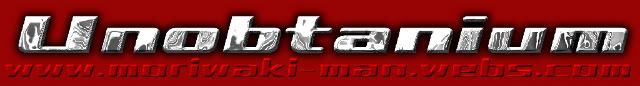
However, I was supried by how many said they wanted to see the website addy more - to me the name was more important but it has been enhanced :smt002

Keeping things simple was my initial idea and fully agree with it , however, time to move on - that is old thinking and what we are taught from our teachers so i am happy to keep textures in the lettering but i have compromised and done plain too :smt001

When the new version went to print the textures just look so right :smt007 and i am swayed towards them rather than the mundane block letters done in primary colours, but they are there for those who want them.

I was asked if they needed to travel to "middle earth" to collect design #3 :smt005 and #1 has some following too.

The new proof will be shown shortly as i am awaiting finalization of a business shift before commiting to the final cut :smt002


PS. I also got the thing about having a "proper" web address - hello! wake up and smell the coffee, who the feck dictates what a real web address is? The very same twat's who want to sit on their butt all day do feck all to enlighten anybody's life but there own and make free money ! Well , i had one answer to that - especially when i went to buy the .com to find it already had been bought and was for sale :smt011 You want find YKK on my zipper :smt019 along with "Go make your own company and enrichen some ones life with what you offer and get off your fat butt" and a few other choice words :smt002 No freakin interest in .com , my website already exist so guess what - ITS REAL !
Nothing worse than having an H and not being able to scratch it !
Living life on the edge, SuPposedly
Post Reply